Next or QuickReplies!?
There is a condition between Next and QuickReplies. Using either Next or QuickReplies, you may connect to other components. But you can't connect to others from both.
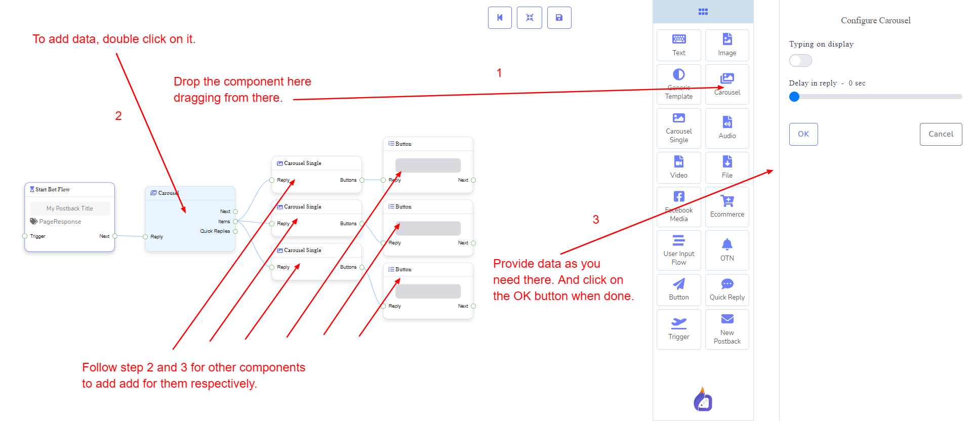
Carousel component will allow you to reply with a carousel. It has 1 input socket and 3 output sockets.
There is a condition between Next and QuickReplies. Using either Next or QuickReplies, you may connect to other components. But you can't connect to others from both.
Reply may get connection from one of the following components:
Next may be connected to one of the following components:
Items may be connected to the following component:
Carousel Single - you may connect up to 10 Carousel Single components to the Carousel components.
Quick Replies may be connected to the following component:
Quick Reply - you may connect up to 11 Quick Reply components to the Carousel components.
Let us see how we can create a reply with carousel
Dragging and Dropping
From the dock menu, drag the Carousel component and drop it on the editor at any place. Next, you see 3 Carousel Single components and 3 Button components have been created with Carousel component.
Adding Data
To add data to the Carousel component, click twice on the body of the Carousel component. It will open a sidebar on your right with only fields asking reply-delay and type-state. Interact with them if you need.
By default, we provided 3 carousel single items. You can add more if you wish. Now it's time to prepare carousel single component. Make double-click on each of them to provide data as you need.
Having done with filling in carousel single, you may go for button component to be provided with your carousel. Make double-click on the button component to fill in data as you need.